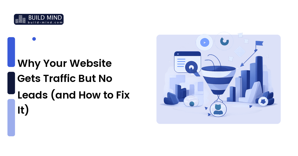
For a small business, your website is usually the first real impression a customer gets — and often the deciding one. Good web design isn't about winning a design award; it's about making it effortless for a visitor to understand what you do, trust you, and take the next step. A clean, fast, clearly-organized site will out-convert a flashy one every time, because design that works always beats design that just looks impressive.
The short version: design around what your customer is trying to do, build the handful of pages that earn trust and drive action, make every page fast and usable on a phone, and make the next step obvious. This guide walks through how to do that without an agency on retainer — or with one, if you'd rather hand it off.
Design for the visitor's goal, not your taste
The biggest mistake small-business sites make is being built around the owner's preferences instead of the visitor's needs. Before any layout decisions, answer one question: what is a visitor trying to accomplish when they land here? Usually it's something concrete — understand what you offer, decide whether to trust you, and find out how to buy or book.
Every design choice should serve that journey. A visitor should be able to answer three questions within seconds of arriving: What do you do? Is it for me? What do I do next? If your homepage doesn't answer those quickly, no amount of visual polish will save it. Good UX (user experience) is simply removing friction between the visitor and what they came to do.
The pages every small business needs
You don't need dozens of pages. You need a few that do their jobs well.
- Homepage. The hub. State clearly what you do and who it's for, show one or two reasons to trust you, and point to the next step. It's a signpost, not a place to say everything.
- Services or products. Explain what you offer in the customer's language — the problem you solve, not just a feature list. If you have distinct offerings, give each its own clear section or page.
- About. People buy from businesses they trust. A genuine About page with real faces and a plain story builds more confidence than polished corporate copy.
- Contact. Make it effortless to reach you: a simple form, plus a phone number, email, and location if relevant. Don't bury this.
- Social proof. Testimonials, reviews, case studies, or recognizable client logos. Real proof from real customers reassures buyers more than any claim you make about yourself.
If you run campaigns or ads, you'll also want landing pages — single-purpose pages built around one offer with one action, and nothing competing for attention. A focused landing page almost always converts better than sending ad traffic to a busy homepage, because it removes the distractions.
Layout and UX that convert
Within each page, a few durable principles do most of the work:
Lead with a clear headline
The top of every page should state, in plain language, what you offer and the benefit to the visitor — not a clever slogan they have to decode. This is the first thing people read and the biggest factor in whether they keep reading. Clarity beats cleverness here every time.
Establish a visual hierarchy
Guide the eye on purpose. Use size, weight, spacing, and color so the most important things — your main message and your primary button — stand out, and supporting details recede. A page where everything shouts for attention reads as a page where nothing matters.
Give elements room to breathe
Generous spacing (white space) isn't wasted space; it makes a page easier to scan and feel more professional. Cramming in more content rarely helps. A calm, uncluttered layout lowers the effort it takes to understand the page.
Make the next step obvious
Every page should have one clear primary action — "Get a quote," "Book a call," "Shop now" — stated in specific words and visible without hunting. Use a button that stands out from everything around it, and repeat it where it makes sense on longer pages. A confused visitor doesn't act, so don't make them guess what to do next.
Don't skip mobile and speed
Two technical realities decide whether your good design actually reaches people.
Most visitors are on phones. A large share of web traffic is mobile, so your site has to look and work well on a small screen, not just on your laptop. Use a responsive design that reflows for mobile, keep tap targets big enough for thumbs, and make sure text is readable without zooming. The honest test is to use your own site on your phone and try to complete the main action — if it's awkward for you, it's costing you customers.
Speed is part of the design. A page that's slow to load loses visitors before they see any of your work, and faster pages tend to convert better and rank better in search. You don't need to be an engineer to help: compress your images (they're the most common cause of slow pages), avoid piling on heavy plugins and scripts, and choose reliable hosting. Test your speed honestly and fix the worst offenders first.
How to choose how to build it
There's no single right platform — only the right fit for your time, budget, and how much control you want.
- Website builders (drag-and-drop platforms) are the fastest and cheapest way to launch, with little technical skill required. The trade-off is less flexibility as you grow. Best for owners who want to be live quickly and manage the site themselves.
- A CMS like WordPress offers more flexibility and ownership, with a steeper learning curve and more maintenance. Best when you expect the site to grow or need capabilities a builder can't offer.
- Hiring a designer or studio gets you a tailored result and saves your time, at a higher upfront cost. Best when the site is critical to your revenue and you'd rather invest than DIY.
Choose based on an honest look at how much time you can give it and how custom your needs are — not on which option sounds most impressive.
Connect design to your brand
A website doesn't stand alone — it's the most-visited expression of your brand, so it should look and sound like everything else you put out. The same logo, colors, type, and voice you use elsewhere should carry through the site, because that consistency is a big part of what makes a small business feel established and trustworthy. If you haven't nailed those foundations yet, start with our small-business branding guide; a clear brand makes every design decision on the site easier and keeps the result coherent.
FAQ
How many pages does a small-business website need?
Fewer than most people think. A homepage, a services or products page, an About page, a Contact page, and some form of social proof cover most small businesses well. Add campaign landing pages if you run ads. Quality and clarity on a few pages beat a sprawling site nobody finishes reading.
What makes a website convert visitors into customers?
Clarity and an obvious next step. Visitors need to quickly grasp what you offer, see a reason to trust you (real reviews or proof), and find one clear action to take. Removing friction — fast pages, easy mobile use, simple forms — does more for conversion than visual flourishes.
Do I need a mobile version of my site?
You need a site that works well on mobile, which today means a single responsive design that adapts to any screen rather than a separate mobile site. Since a large share of visitors browse on phones, a site that's hard to use on mobile loses real business.
How important is page speed?
Important enough to treat as part of the design, not an afterthought. Slow pages lose visitors before they see your content, and faster sites tend to convert and rank better. Compressing images and avoiding heavy plugins are the highest-impact fixes most owners can do themselves.
Should I use a website builder or hire a designer?
It depends on your time, budget, and how custom your needs are. Builders are fast and affordable for DIY; a designer or studio saves your time and delivers a tailored result for more money. Pick based on how central the site is to your revenue and how much you want to manage yourself.
Next step
Start by mapping what your customer is trying to do, then build the handful of pages that help them do it — and make the next step obvious on every screen and every device. Keep it clear, fast, and consistent with your brand, and your website will quietly do sales work for you around the clock.
Want a second pair of eyes on your site's structure or conversion path? Talk to the team at Build Mind — we help small businesses build sites that turn visitors into customers.